Summarizing Categorical Data
From data frames to tables. From tables to bar charts.
WarningThis page covers…
- Using “help” pages to understand how a function works
- Arguments to functions: required or optional, named or unnamed
- More about packages (
tidyverse,stat20data) - Making plots with
ggplot - Making bar charts
- Setting colors and other “aesthetic attributes”
- Stacked, dodged, and stacked+normalized bar charts.
In this tutorial we’ll grow your R toolbox to visualize categorical data but first, a very general skill: how to ask for help.
Help and Arguments
Help pages
Every function in R has a built-in help file that tells you about how it works. It can be accessed using ?.
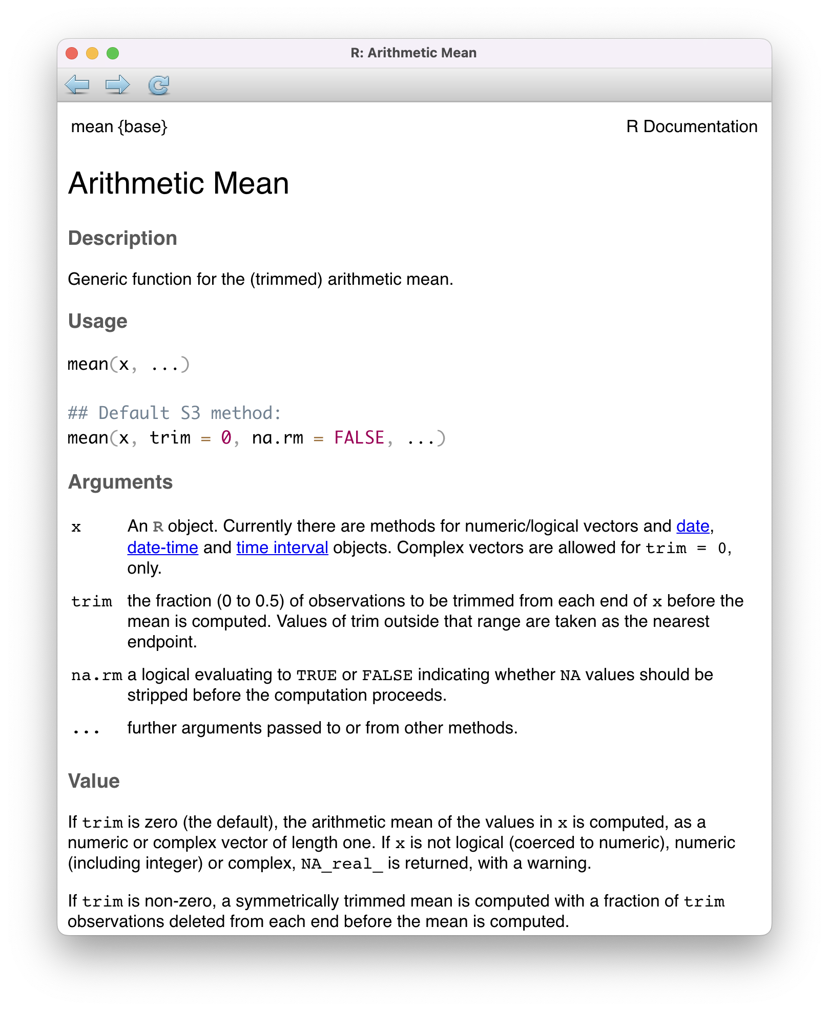
mean().
?meanWhen you run this, RStudio will open a help file in the bottom right pane of your screen. We’ve shown you this help file in the image on the right of the page here ⮕
What you always see at the top of such a help file is how to use that function:
Usage:

     mean(x, ...)

     ## Default S3 method:
     mean(x, trim = 0, na.rm = FALSE, ...)
“Usage” – basically, how to use this function. The first line mean(x, ...) is saying, “mean is a function that requires at least one argument.”
Required and optional arguments, named and unnamed arguments
All arguments have names. In this case, the first argument is named x (you saw mean(x, ...) in the help page). You don’t usually need to know this – if you run the code cell below, it works fine:
No mention of x anywhere. You could, if you wanted, explicitly give the name, though this is unnecessary:
That still works just the same.
OK so who cares?
Many functions offer extra optional arguments, which fine-tune how the function runs. The second “Usage” line in the help file is showing you this:
mean(x, trim = 0, na.rm = FALSE, ...)All of the arguments that end in = (something) are “optional.” In this function, all arguments are optional except x. x is a required argument, you HAVE to set it. mean NEEDS numbers to do anything useful at all. But the others arguments are optional. Tweaks to how mean behaves.
To demonstrate, let’s see what trim and na.rm do. Here is mean without either of them:
The average of these numbers is huge (2030) because you have a giant outlier value (10000) pulling things up. Sometimes you want to discard such outliers. That is, you want to trim off extreme values before taking the mean. This is exactly what trim does:
The trim = 0.2 says, “Ignore the highest 20% of the data and the lowest 20% of the data. Take the mean of what’s left (the middle 60%).” There’s 5 numbers in the list, so 20% means we ignore the 1 lowest value (0) and the 1 highest value (10000) and compute the mean of what’s left: 46, 49, and 55 (whose mean is 50).
The original scores vector is unchanged by all this. We just told mean to do its calculation a little differently.
Also, notice the = 0 in the help page line:
mean(x, trim = 0, na.rm = FALSE, ...)The fact that trim is followed by = 0 means that 1) trim is an optional argument, and 2) if you don’t set this argument, mean is going to assume it is zero (and trim nothing). You can explicitly set trim = 0 to see for yourself that it does nothing:
The na.rm argument, which you’ll use far more often
Let’s say we take some measurements of a bunch of penguins (height, weight, bill size, etc), but we forgot to measure the weight of one of them. In our final dataset, there will be a missing value (we don’t know one penguin’s weight). When loaded into R, such missing values show up as NA (“Not Available”). Anytime you try to do math involving NA, the result is NA:
That means if we try to compute the average weight of some penguins, including some NA (missing) values, this happens:
The result is NA. The mean function is basically telling you, “Look, you have some missing data, so I’m not going to compute a sketchy average. I’m giving you NA back.”
You have to explicitly tell R that you are okay dropping the NA values from the calculation. This is the purpose of the argument na.rm (as in, “remove NAs”).
Again, look at the documentation where it says:
mean(x, trim = 0, na.rm = FALSE, ...)Notice the na.rm = FALSE. So unless you say otherwise, it’s not going to remove NA values before doing the mean. You have to explicitly set it to TRUE:
Now this works. Setting na.rm = TRUE removed the NA before averaging the numbers. It didn’t change the original vector – penguin_weights still has an NA in it – it just now ignores that NA when doing the calculation.
You accompished this by changing a default argument (na.rm) from FALSE to TRUE.
One last point about named arguments and optional arguments
Whenever you don’t name an argument, R uses the order of arguments to guess which is which. The help page tells you this expected order: mean(x, trim = 0, na.rm = FALSE, ...). So the code below actually works, since R expects trim to be the second argument and na.rm to be third:
This is equivalent to saying mean(penguin_weights, trim = 0.2, na.rm = TRUE). You put the argument values in the right places, so R got the idea.
More about packages
We talked about packages in an earlier tutorial. Let’s learn a bit more.

tidyverse library, which contains many useful packages for data scienceIn Intro to Coding (linked to above), we learned about a few different functions that can be used on vectors, such as mean(). We also learned about a function called data.frame(), which allowed us to bring vectors together as part of a new structure called a data frame, with each of the vectors used as columns.
While the base functionality provided by R is powerful, developers often seek to find more efficient ways to complete tasks. In doing so, they push the power of R forward. R has a vast ecosystem of packages that add new functions. Any installed package can be loaded with the library() function. As in, “go into the library and find this package and load it.” Let’s load tidyverse, which has a lot of the core functionality we will use in this course:
library(tidyverse)You will need to have this code at the top of *every quarto document where you want to use tidyverse functions. More on that later.
The tidyverse package is actually a collection of smaller packages, all of which are useful to us. You don’t need to know their names, but here’s the main ones we care about:
ggplot(also calledggplot2) - for making plots and graphsdplyr- for creating summary tables, cleaning up your data frame, making new columns, and other “data wrangling” tasks (coming soon)
Today, our focus is to summarize categorical data, and one avenue we have explored already is a visual summary; a bar chart. Let’s explore how the plots shown earlier in this set of notes were made. We will use ggplot, tidyverse’s resident visualization package.
First, we should load the penguins data into our environment. The penguins data is actually located in a special package made just for this course called stat20data. This package hosts the datasets which will be the subjects of your labs. Therefore, we need to load this package first.
library(stat20data)You can use penguins right away. But it won’t show up in your environment (upper right pane, which shows all your variables) until you run:
data(penguins)Once you do this, you will see the penguins dataset, in all of its glory, appear in the environment pane at the top right of your RStudio session (you may need to click in the area once or twice).
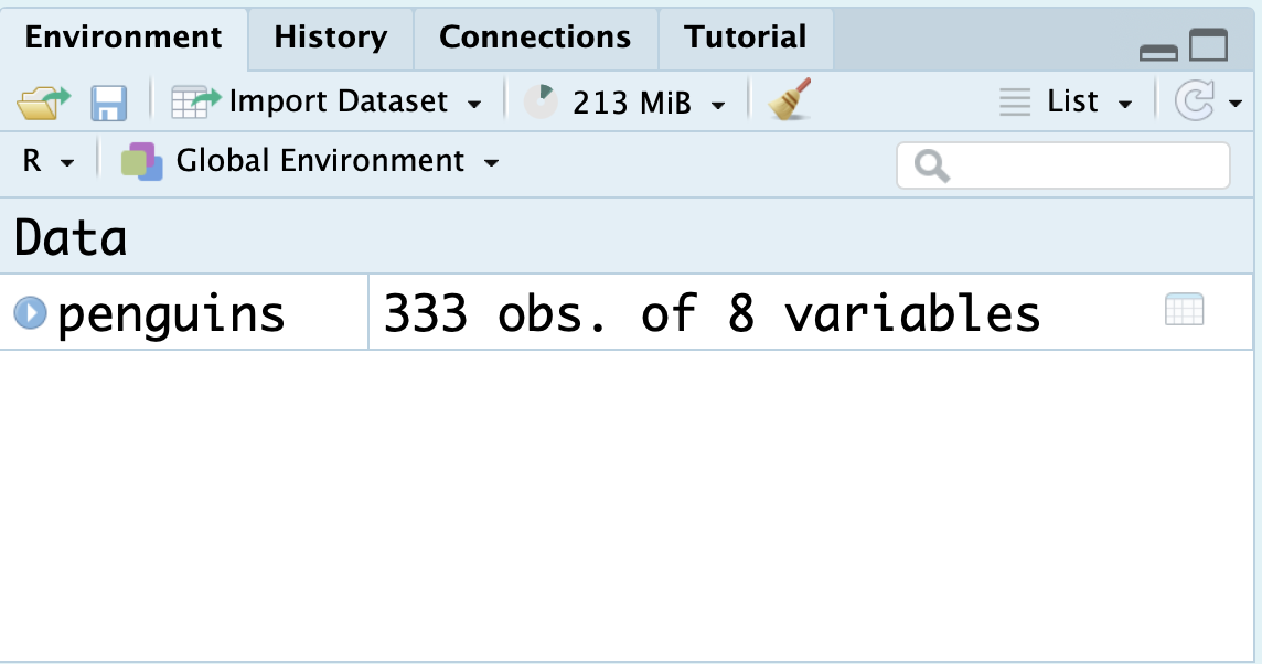
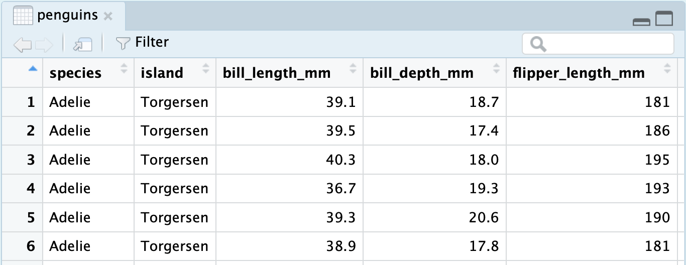
You can click the blue dropdown arrow to see each variable in the dataset, or for a more traditional view, you can click the white spreadsheet icon to the right:
Installing vs Loading a package
Think of a package as a book. When your computer reads that book, it learns new things, new functions, which you can then use and the computer will now understand. It can’t understand ggplot until it’s read the tidyverse book.
Before you can read a book, you have to get your hands on a copy of it. This is what installing a package does. It downloads the package contents onto your computer’s hard drive, permanently storing it. It’s like you are “buying the book” and putting it on your bookshelf. You have it forever. That doesn’t mean you’ve read it, though…
When you load a package, you are telling R to actually open the book and read it. Then it actually learns what (say) ggplot means, so it can understand your commands that use it. If you ever restart R, it gets a full brain-wipe and forgets every package it’s ever loaded. So you have to do it again. You have to load packages fresh in every Quarto document you work in.
If you tell R to read a book that isn’t on its bookshelf, it will complain. You have to install a package before you can load it.
Code wise:
- Installing a new package looks like this:
install.packages("tidyverse")- You will rarely have to do this in Stat 20. We have pre-installed almost all the packages you’ll ever need in this course.
- You only need to run
install.packagesonce, as it stores real files on the computer’s hard drive. Install it once,tidyversewill forever be ready for reading. Even if you restart R, your computer still has the files it needs for this package, so you don’t need to install it again.
- Loading a package looks like this:
library(tidyverse)- You need to do this at the top of every Quarto file you work on. When you “render” your Quarto document, the first thing that happens is that R’s “brain” gets wiped, forgetting all the variables and every package it’s ever read, and then it runs your code fresh from the top down. So be sure your Quarto documents always have the right package-loading lines at the top.
A first visualization with ggplot
Now, we’re ready to write some ggplot code and make our first visualization of the year! We will create the exact stacked, normalized bar chart you saw earlier in the notes:
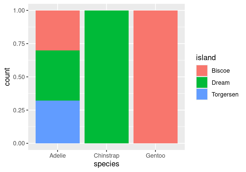
We can’t tell how many penguins are on each island or of each species from this plot, but we can see how island and species are associated. Remember, this plot is “normalized,” meaning each total bar height is the same. You’re comparing the mix of colors in each bar to see if they vary (indicating an association between the variables).
The main function within the ggplot package is, well, ggplot().
ggplot(data = penguins)
The ggplot() function requires, as its first argument, a data frame (the data argument). By itself, there’s not much to look at; it just creates a blank canvas. We haven’t told it what kind of plot to make, what about the penguins we want to visualize, or anything else.
In making a plot from a dataframe, you have to map variables to attributes in the plot. What’s the x axis? What’s the y? Should something be different colors?
Here we want the species of penguin on the horizontal (x) axis. This piece of information (which is known as an aesthetic attribute of the plot), goes into a second argument called mapping and within a function called aes(). It’s a bit confusing, but you’ll quickly get used to typing your plotting code this way:
ggplot(data = penguins,
       mapping = aes(x = species))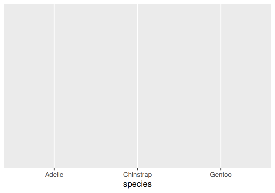
Now we’re getting somewhere. We can see the x axis has been set up with labels for the species of penguins. We have a canvas, with axes. But we haven’t told it what to draw yet.
To do this, after we create the base plot (above), we have to add layers to draw stuff or change how it looks. Literally with the addition + symbol to “add” the layer to the plot.
Geometry: Many “layers” draw actual shapes (“geometries”), and have names like geom_bar (for bar shapes), geom_point (for dots), or geom_boxplot (for boxplot boxes).
geom_bar is the simplest. It says not only “draw bars” but also “make each bar’s height equal to the number of rows with that value.” Here’s what we mean:
ggplot(data = penguins,
       mapping = aes(x = species)) +
  geom_bar()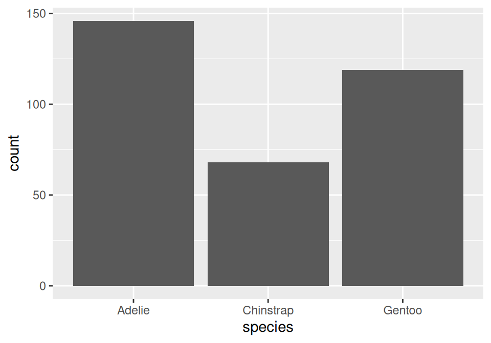
Here we can see that we have about 150 Adelie penguins, about 70 Chinstraps, and about 120 Gentoos. More precisely, the plot is saying “I found 150 rows where the species column was equal to "Adelie", 70 rows where the species column was "Chinstrap", and 120 rows where it was "Gentoo".
Also notice: we didn’t have to tell it anything about the y axis! This is special to geom_bar, which inherently makes the y axis mean “count how many rows have this value.” It’s even labeled “count” (see the y axis in the plot above).
Note that the bars are not colored yet, just a boring gray. One thing we can do is just make every bar a different color; specifically, by adding an extra aesthetic mapping. Note that for bars, fill means the actual bar color, while color just means the outline color of the bar:
ggplot(data = penguins,
       mapping = aes(x = species,
                     fill = species)) +
  geom_bar()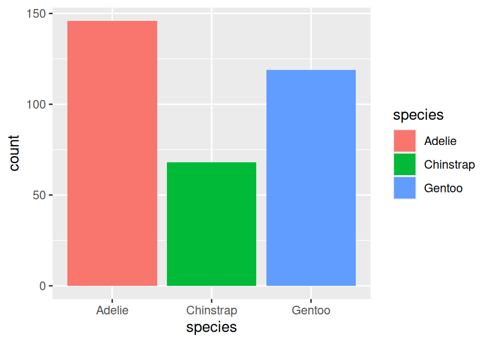
We’ve used species twice here. Both the x-axis and the fill color are determined by the penguin species.
But we’re not yet at our goal. We don’t want the bars to be uniform in color, but rather to be filled in with colors according to how many of those penguins live on each island. With a small change, we can get there:
ggplot(data = penguins,
       mapping = aes(x = species,
                     fill = island)) +
  geom_bar()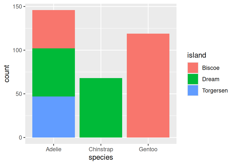
All we did was change fill = species to fill = island. The fill color within each bar is going to be determined by the number of those penguins living on that island.
Last step
What we have right now is just a stacked bar chart. As you learned in the notes today, this isn’t the easiest way to compare the mixture of islands within each species, since the bars are all different heights. Ideally all bars would be the same height, and the proportion filled with each color tells us the proportion of that species living on that island.
The solution is to tweak geom_bar. geom_bar is absolutely a function as well. One of its optional arguments is position. It defaults to a stacked bar chart (above), but we can fix this by setting the position argument to the text "fill" (as in, “fill up the whole y axis!”).
ggplot(data = penguins,
       mapping = aes(x = species,
                     fill = island)) +
  geom_bar(position = "fill")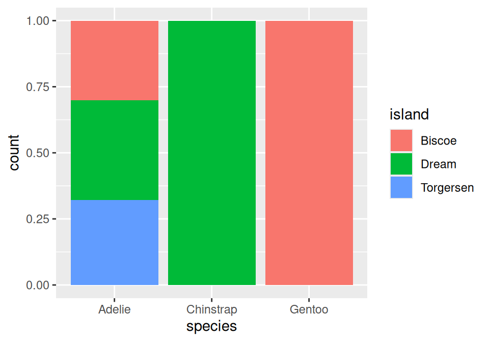
And there we have it. Each bar has the same height, and the y axis shows us what proportion of those specific penguins live on each island. You can see that Chinstraps exclusively live on Dream Island, Gentoos on Biscoe Island, and Adelies live on all three islands in roughly equal measure.
One more type of bar chart: dodged.
A side-by-side (dodged) bar chart can be produced by replacing "fill" with "dodge". It makes a separate bar for each species-island combination, but puts same-species bars clustered together. Sometimes this is a helpful way to look at it:
ggplot(data = penguins,
       mapping = aes(x = species,
                     fill = island)) +
  geom_bar(position = "dodge")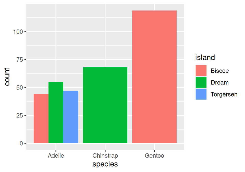
Depending on what you’re doing, any of these plots might be the right choice. There are always judgment calls in data visualization – how do you make it easy for the right story to jump off the page?
We have a whole unit on the art and science of data visualization in a few weeks. We think you’ll enjoy it.