# A tibble: 333 × 8
   species island    bill_length_mm bill_depth_mm flipper_length_mm body_mass_g
   <fct>   <fct>              <dbl>         <dbl>             <int>       <int>
 1 Adelie  Torgersen           39.1          18.7               181        3750
 2 Adelie  Torgersen           39.5          17.4               186        3800
 3 Adelie  Torgersen           40.3          18                 195        3250
 4 Adelie  Torgersen           36.7          19.3               193        3450
 5 Adelie  Torgersen           39.3          20.6               190        3650
 6 Adelie  Torgersen           38.9          17.8               181        3625
 7 Adelie  Torgersen           39.2          19.6               195        4675
 8 Adelie  Torgersen           41.1          17.6               182        3200
 9 Adelie  Torgersen           38.6          21.2               191        3800
10 Adelie  Torgersen           34.6          21.1               198        4400
# ℹ 323 more rows
# ℹ 2 more variables: sex <fct>, year <int>Data Visualization
STAT 20: Introduction to Probability and Statistics
Warmup Questions
What is the issue in these commands?
Can you spot the bug(s)?
the x and y mappings need to be specified inside aes()
Can you spot the bug(s)?
the plus sign + is missing after ggplot() and before geom_point()
Can you spot the bug(s)?
- missing comma between arguments
xandyinsideaes() - missing closing parenthesis of
ggplot() - cannot use pipe operator
|>; must be+ - misspelled
goem_point()
Agenda
Announcements
Review
Worksheet
Lab Flights II
Announcements: Retake of Quiz 1
Retake of Quiz-1
- Timeslots: through Sep 25
- Content: Weeks 1-2
Review
Palmer Penguins
Question: In terms of the way they are constructed …
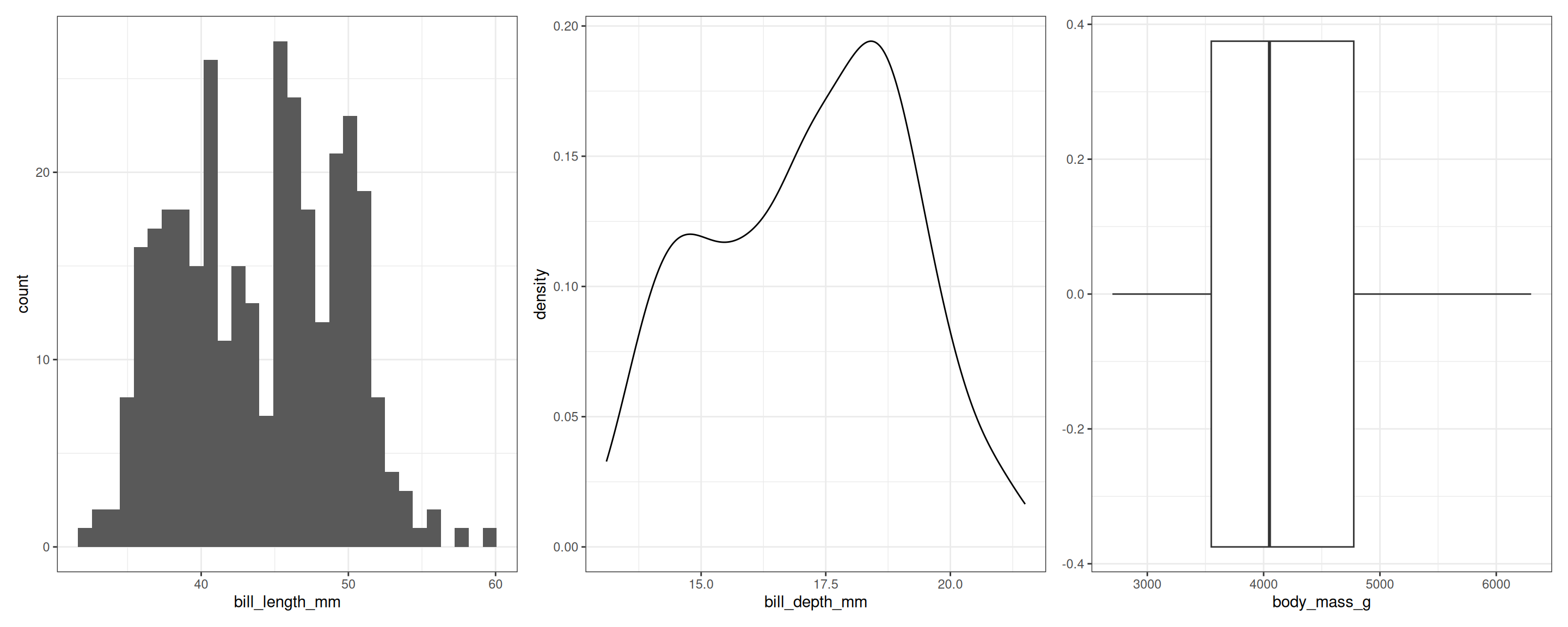
What do these plots have in common? How do they differ?
01:30
Question: What do these plots have in common? How do they differ?
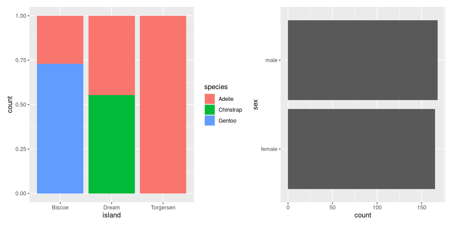
01:30
Question: What are the aesthetic mappings and geometries used here?
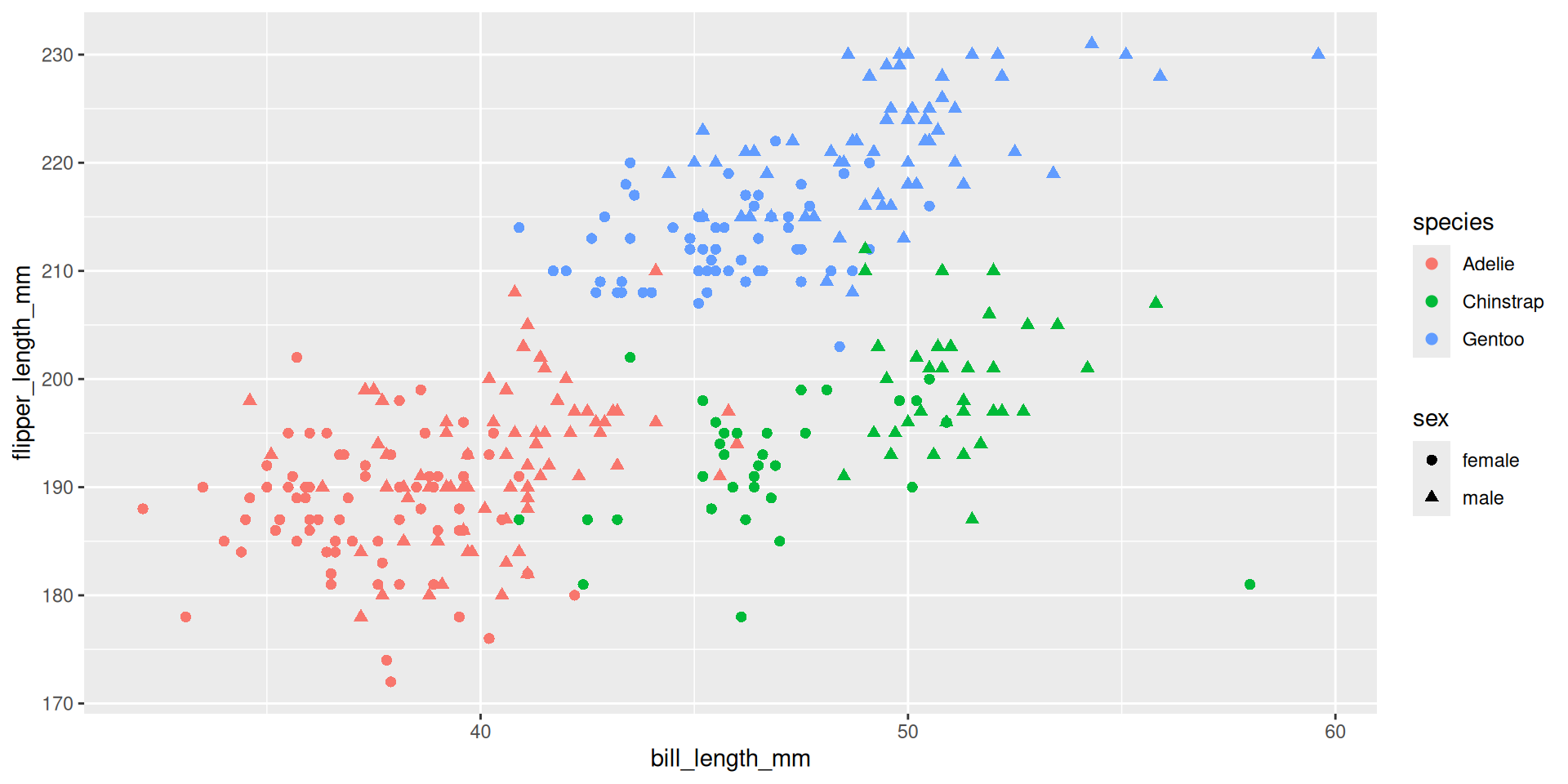
01:30
Analytical Tasks (by Stephen Few)
7-Core Analytical Tasks (by Stephen Few)
- Times-series analysis
- Ranking analysis
- Part-to-Whole analysis
- Deviation & Comparisons against a benchmark
- Distribution analysis
- Correlation & Regression
- Multivariate
- Other*
Your Turn: Worksheet
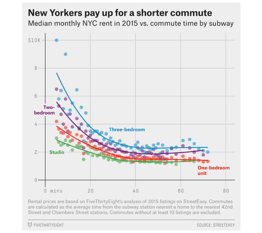
For each graphic below, answer the following questions:
- What geometry/geometries are used?
- What variable is mapped to the x-axis?
- What variable is mapped to the y-axis?
- Are other visual attributes used (e.g., size, shape, facets)?
- How is color used: data-encoding or decorative?
- How many total variables are represented in the graphic?
- What primary analytical task(s) (Few) does the plot serve?
- If annotations are present:
- do they describe data points?
- or do they highlight a specific takeaway?
Write your answers in today’s worksheet
NOTE: You do NOT need to write ggplot code today. Today’s worksheet is conceptual and requires you to think through the Grammar of Graphics framework.
Plot 1
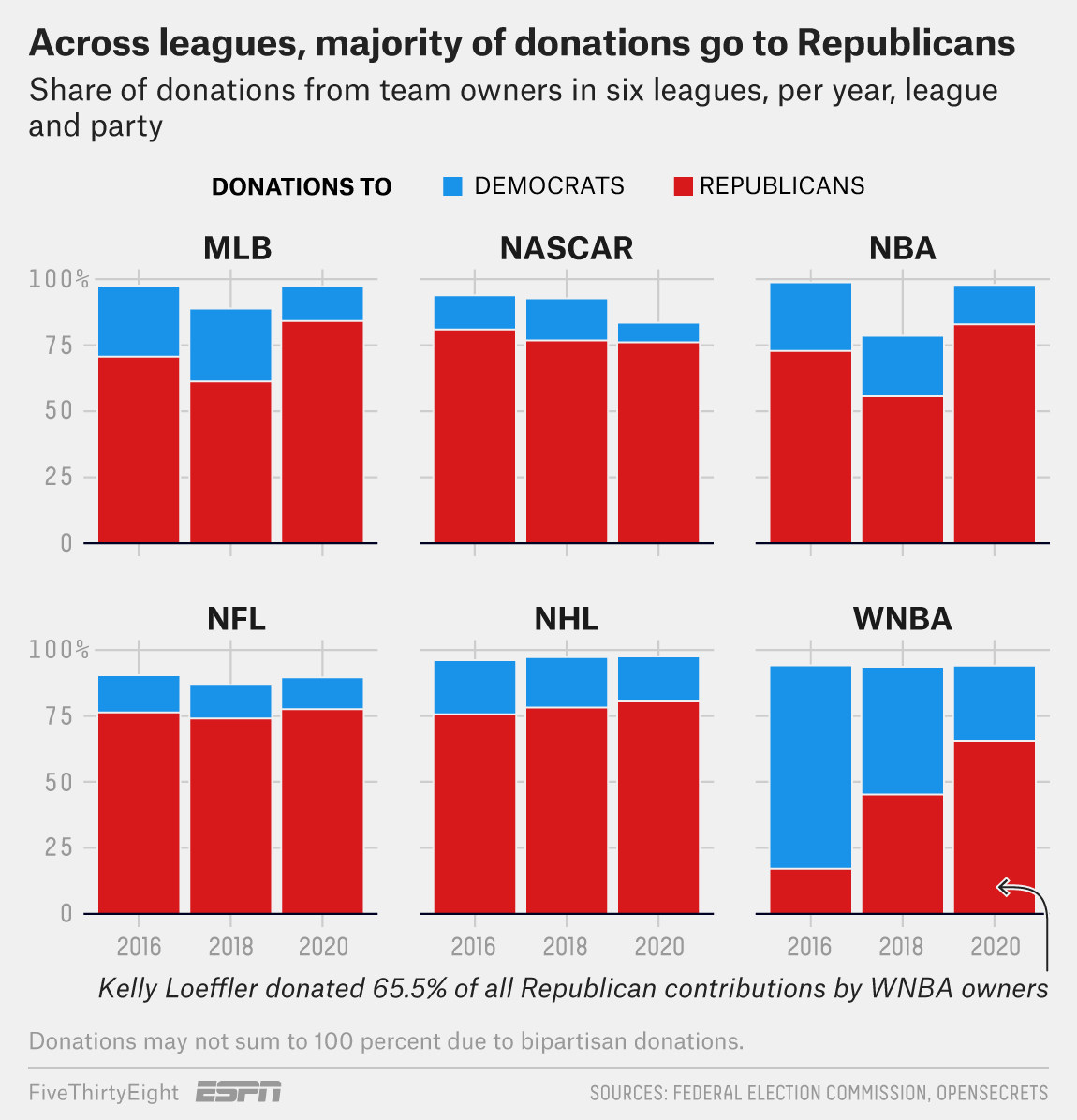
Plot 2
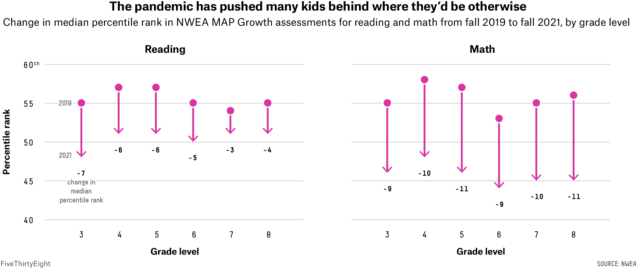
Plot 3
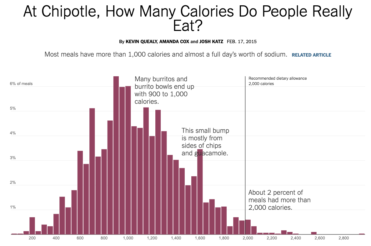
Plot 4
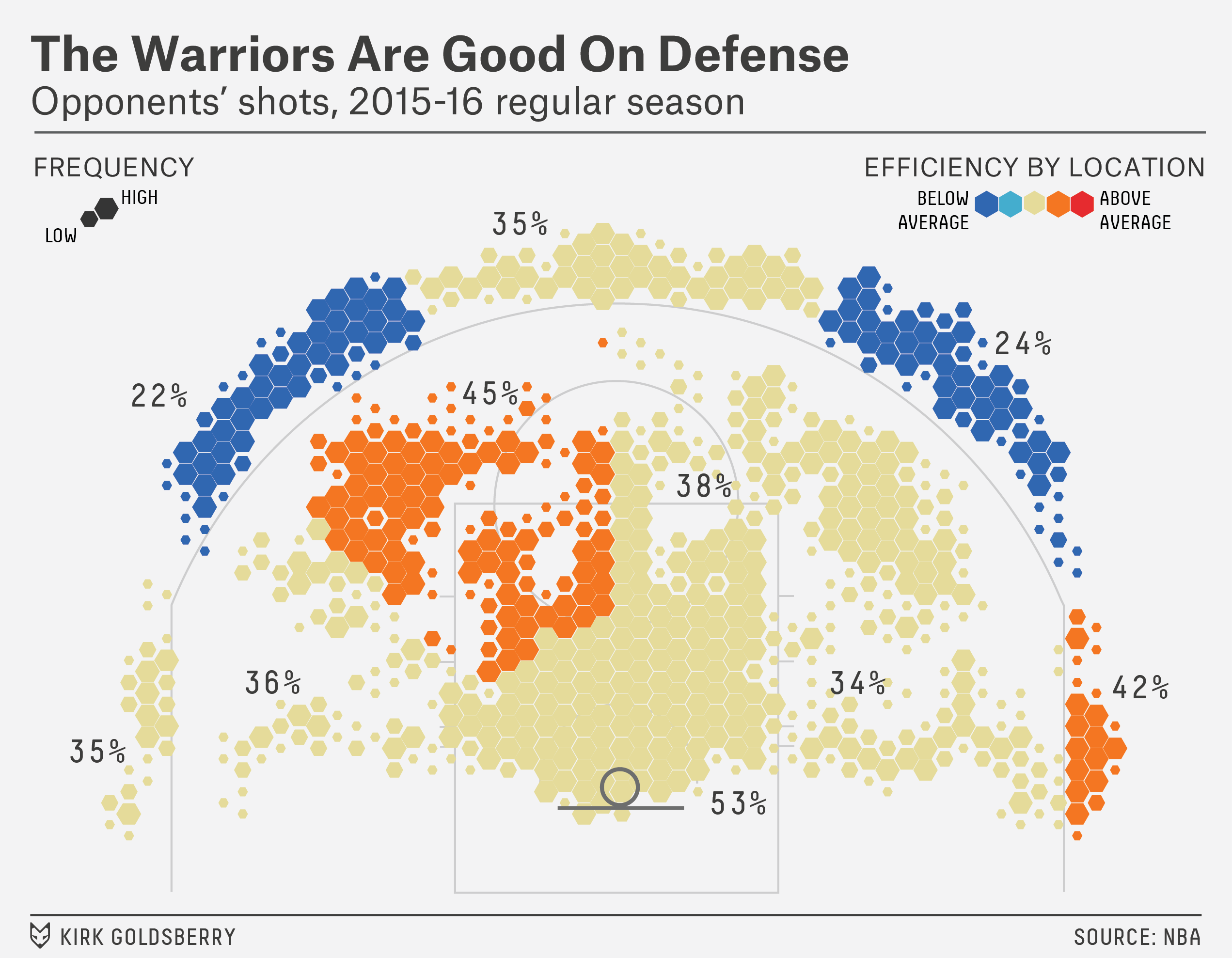
Plot 5
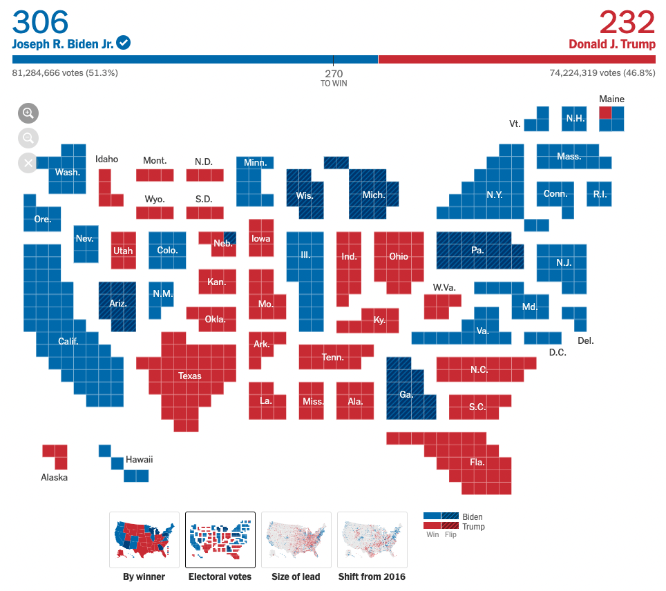
Plot 6
Lab 4: Flights II (cont’d)
End of Lecture