A Grammar of Graphics
STAT 20: Introduction to Probability and Statistics
Concept Questions

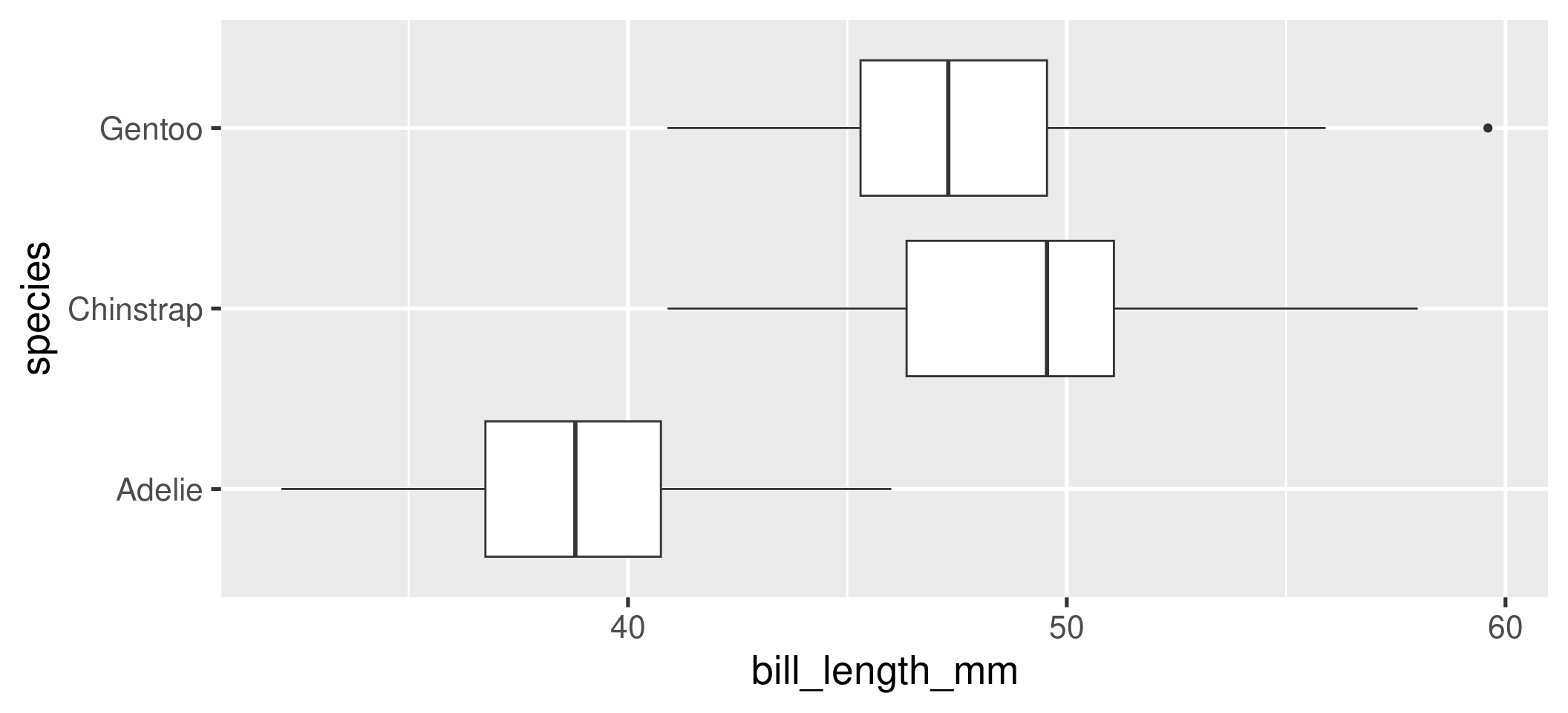
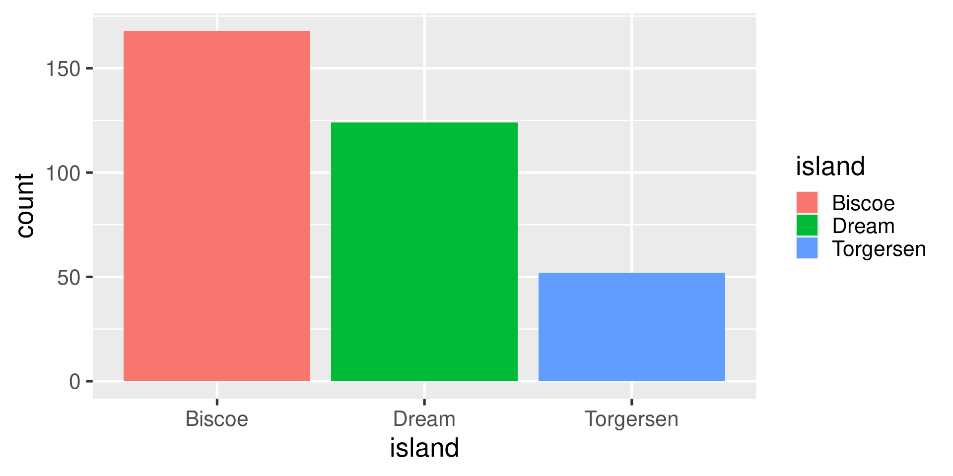
- What are the aesthetics and geometry of this plot?
01:00

What code was used to make this plot?
01:00
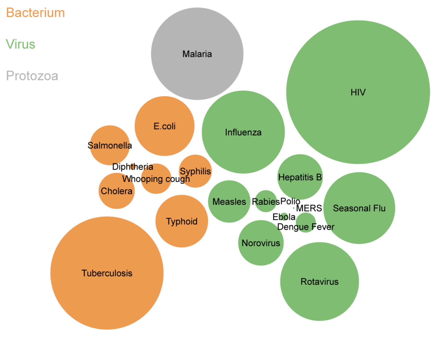
Global infectious disease prevalence in 1989

- What are the aesthetics and geometry of this plot?
01:00
Concept Activity
Concept Activity
You will be watching a 2.5 minute video of a presentation by a scientist, Hans Rosling, who studied global public health. He presents data visualizations depicting the change in life expectancy and family size over several decades in the 20th century.
On a piece of note paper:
- Sketch out the data frame used to create the graphic and add the names of the variables.
- List the aesthetic attributes used to encode the data in the graphic.
- Identify the geometry used in the plot.
Please turn to your neighbors and…
Discuss what you came up with in terms of . . .
- the variables present in the data frame
- the aesthetic attributes used to encode that data in the plot
- the geometry
01:00
What were the variables and aesthetic attributes?
Visual Cues / Aesthetics
- Location along the x-axis
- Location along the y-axis
- Size of point
- Color of point
- Animation
Variables
- Fertility rate
- Life expectancy
- Population
- Region
- Year
What did the data frame look like?
What was the unit of observation? What were the variables? What were their type?
Unit of observation
- A country in a given year
Variables
- Fertility rate (continuous)
- Life expectancy (continuous)
- Population (continuous)
- Region (nominal)
- Year (discrete)
What geometry is used to represent the observations?
- Points
Break
05:00
Problem Set: A Grammar of Graphics
20:00
Lab: Flights
20:00
